

Open your homepage. Count to five. Then look away. Can a stranger still say who you help, what you do, and the next click? If not, ads and a new logo will not save the page.
This is the 5-second test. It is not a design award. It is whether a busy owner understands you before they bounce.

The three sentences that must be obvious
- Who: “For clinic owners”, not “innovative solutions”.
- What: the thing they buy or book (a site, a product, a visit).
- Next click: one primary button. Book, shop, or WhatsApp — not five equal buttons.
If those three live below a huge slider, they do not exist. People do not wait for slide three.
Checklist (use on phone and desktop)
- Headline names the customer or the job, not your company slogan.
- There is one main button. Secondary links are quieter.
- Proof is nearby: a name, a number, or a photo of the real work — not stock handshakes.
- The menu has fewer than 7 items. Extra pages go under “Services”.
- The first screen is not a video that autoplays with sound.
- On a phone, the button is thumb-reachable without pinching.
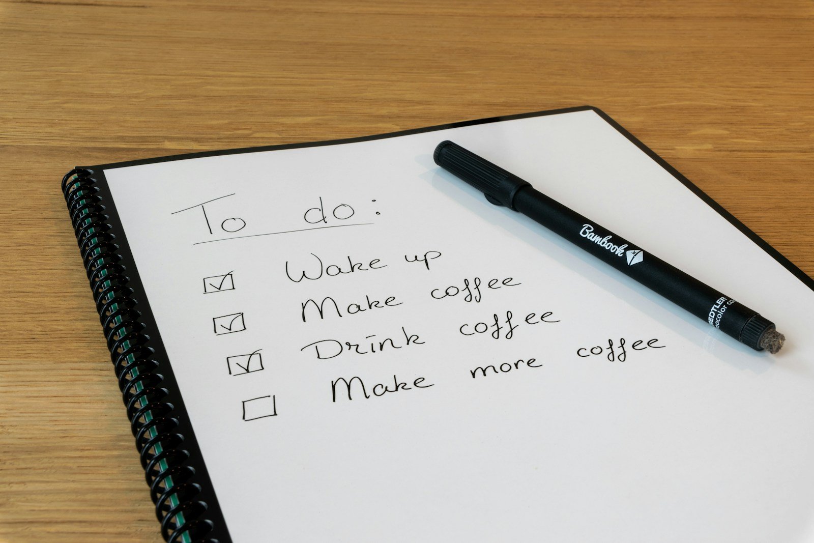
How to run the test without guessing
Show the homepage for five seconds to someone who does not work in your company. Ask only: “What do they do, and what would you click?” If they shrug, rewrite the top. Do not add more sections yet.
Want a 15-minute 5-second test together?
Share the URL. We will say what to keep, what to hide, and which button should be the only loud one.